
Using Components
What is a component?
A component is a modular building block that houses content for your page. We have a large collection that continues to grow! Feel free to experiment with the ones we currently have available.
For detailed information about each component, please refer to component documentation, accessible via the sidecar navigation.
Using the different hero area components
There are 5 types of hero areas: Simple, Split, Carousel, Image and Longform.

Simple Hero Area
This component is the default. Simply fill in the H1 and some intro text, and it will display automatically. You have the option to use a mosaic or leave it empty.

Split Hero Area
Add an image in the right hand sidebar and the code handles the rest.
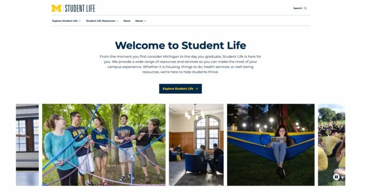
Carousel Hero Area
Designated ONLY for the Student Life home page
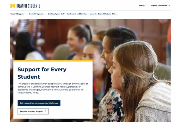
Image Hero Area
Designated ONLY for unit home pages, will populate automatically. A large image background and a callout box with your choice of positioning.
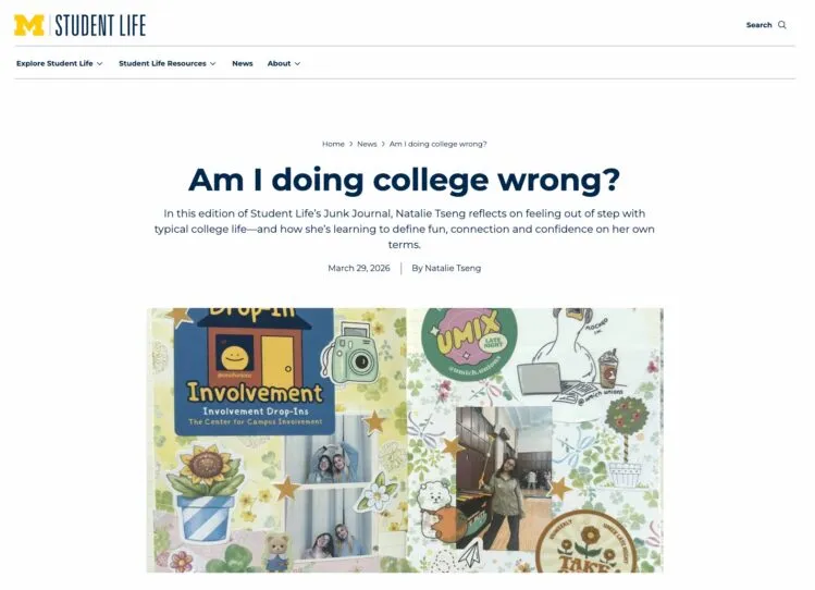
Longform Hero Area
Automatically set for ALL news articles
Adding a component
From your page editor:
Click the blue plus button (block inserter) in the top left or your page editor
OR
Click the add block bar
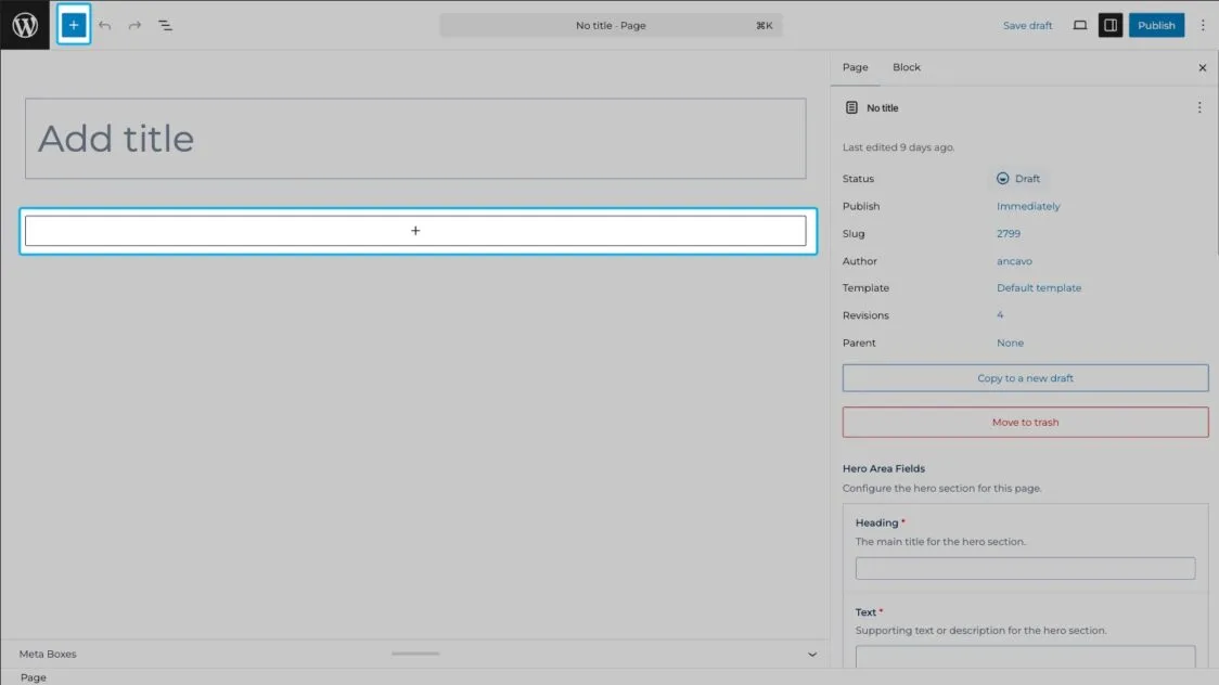
The blue plus button will populate the full component list.
The add block bar will populate your most recently used components. Select “browse all” to display the full component list.
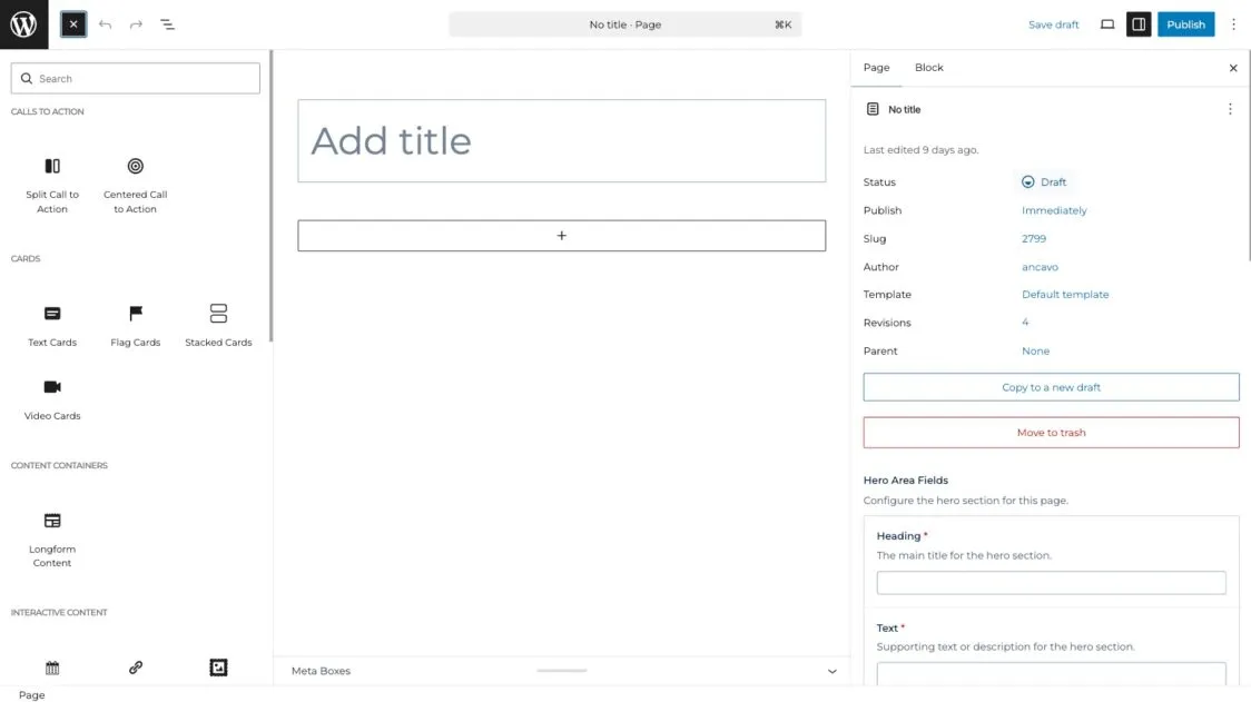
For a guided walkthrough of how to add components, please watch this video:
Longform Content Component
The longform content component houses multiple other components. These components are designed to display within a narrower content container, ideal for content and news articles.
The components nested within longform content:
- Headings
- Body copy
- Accordions
- Buttons
- Images
- Video
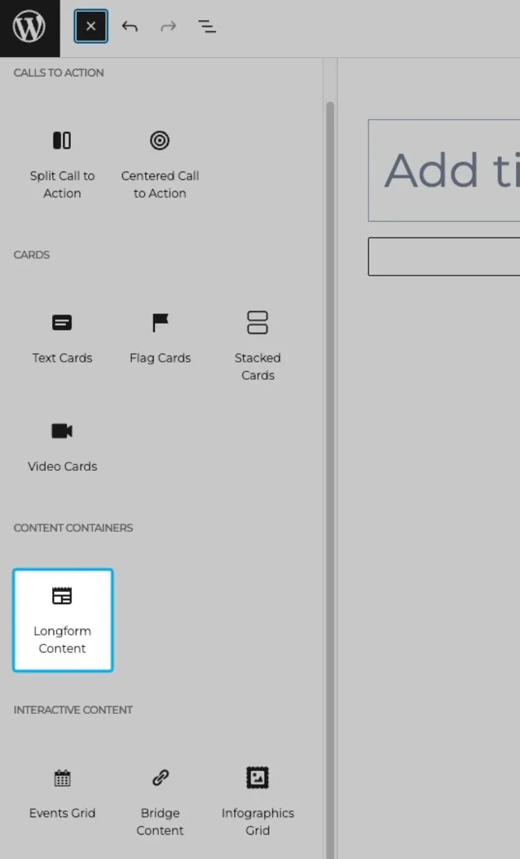
1. To add any of the above components, first add a longform content component from the component list.
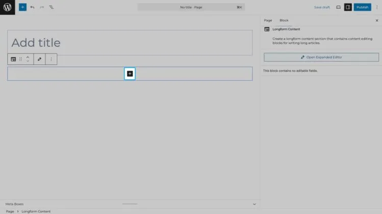
2. Once you’ve added your longform content component, click the black plus button to access the components nested within.
For a guided walkthrough of how to work with the longform content component, please watch this video: